KMPBase
The kmpbase module is the core component of the SweetMeSoft KMP project. It provides a robust architectural foundation and a comprehensive set of UI components, utilities, and network helpers for Kotlin Multiplatform development. It is designed to accelerate cross-platform application development by abstracting common patterns and boilerplate code.
Installation
Add the dependency to your version catalog or build file.
Version Catalog
[versions]
sweetmesoft = "2.0.1"

[libraries]
sweetmesoft-kmpbase = { module = "com.sweetmesoft.kmpbase:kmpbase", version.ref = "sweetmesoft" }
Gradle (Kotlin DSL)
implementation(libs.sweetmesoft.kmpbase)
Android Initialization
For Android applications, you must initialize the library in your MainActivity within the onCreate method. This sets up edge-to-edge styling and caches the activity context for platform-specific library APIs.
import android.os.Bundle
import androidx.activity.ComponentActivity
import androidx.activity.compose.setContent
import com.sweetmesoft.kmpbase.BaseAndroid.Companion.initSweetMeSoft

class MainActivity : ComponentActivity() {
    override fun onCreate(savedInstanceState: Bundle?) {
        super.onCreate(savedInstanceState)

        // Initialize SweetMeSoft KMP Library core Android features
        initSweetMeSoft(this)

        setContent {
            App()
        }
    }
}
Why initSweetMeSoft is Used
- Platform Context Caching: Stores a static reference to the
ComponentActivity. This allows platform-specific services in other components/utilities (like maps integration, vibrator feedback, files sharing, image transformations, and app version checks) to retrieve a valid context without requiring developers to passContextparameters through common/shared Compose logic. - Edge-to-Edge display: Automatically triggers
enableEdgeToEdge()on the activity, enabling modern, immersive, borderless Compose layouts.
Architecture
This module promotes a consistent architecture using a suite of BaseScreen composables and BaseViewModel.
BaseScreen
BaseScreen provides a standardized screen structure with built-in support for:
- Navigation integration (Voyager)
- Top app bar customization
- Global loading state handling
- Global alert dialogs (Info, Confirm, Prompt, Progress)
- Floating Action Button (FAB) support
@Composable
fun HomeScreen() {
    BaseScreen(
        title = "Home",
        showTop = true,
        fabAction = { /* Handle FAB click */ }
    ) { paddingValues ->
        // Screen content
        Column(modifier = Modifier.padding(paddingValues)) {
            Text("Welcome to the Home Screen")
        }
    }
}
Advanced Screen Types
In addition to BaseScreen, the module offers specialized screen layouts:
BaseBottomBarScreen
Manages a screen with a bottom navigation bar. It requires a list of BaseTab items.
@Composable
fun MainScreen() {
    val homeTab = object : BaseTab {
        override val baseOptions = defaultBaseTabOptions(
            title = "Home",
            icon = rememberVectorPainter(Icons.Default.Home),
            showTop = true
        )

        @Composable
        override fun Content() {
            // Tab content
        }
    }

    BaseBottomBarScreen(
        tabs = listOf(homeTab, profileTab)
    )
}
BaseDrawerScreen
Manages a screen with a side navigation drawer. Similar to BaseBottomBarScreen, it uses BaseTab for navigation items.
Supports a customizable headerHeight and a full-bleed headerBackground (such as a banner image) behind the padded headerView content overlay.
@Composable
fun MainScreen() {
    BaseDrawerScreen(
        tabs = listOf(homeTab, settingsTab),
        headerHeight = 150.dp,
        headerBackground = {
            Image(
                painter = painterResource(Res.drawable.header_drawer),
                contentDescription = "Header Background",
                modifier = Modifier.fillMaxSize(),
                contentScale = ContentScale.Crop
            )
        },
        headerView = {
            // Content overlayed on top of the background with padding
        },
        logoutAction = {
            // Handle logout
        }
    )
}
BaseBottomSheetScreen
A wrapper for screens displayed within a bottom sheet. It includes a standard top bar with a close button.
BaseBottomSheetScreen(
    title = "Details",
    showTop = true
) {
    // Bottom sheet content
}
BaseViewModel
BaseViewModel serves as the base class for ViewModels, offering:
- Coroutine scope management
- Permission handling helpers
- Navigation integration
class HomeViewModel : BaseViewModel() {

    fun checkCameraPermission() {
        viewModelScope.launch {
            val granted = requestPermission(Permission.CAMERA)
            if (granted) {
                // Permission granted
            }
        }
    }
}
Pre-built Screens
The module includes common screen implementations to speed up development.
SplashContent
A configurable splash screen with logo animation and automatic navigation after a delay.
SplashContent(
    logo = painterResource(Res.drawable.logo),
    waitMillis = 2000,
    title = "My App",
    action = {
        // Navigate to next screen
        navigator.replace(HomeScreen())
    }
)
AboutContent
An “About” screen displaying app version, logo, and links.
AboutContent(
    logo = painterResource(Res.drawable.logo),
    appName = "My App",
    appId = "com.example.myapp"
)
UI Components
Lists and Grids
The module provides LocalList/RemoteList for linear lists and LocalGridList/RemoteGridList for grid layouts.
LocalList / LocalGridList
For displaying static or locally available data.
LocalList(
    list = myDataList,
    title = "My Items",
    addClick = { /* Handle add */ }
) { index, item ->
    Text(text = item.name)
}

LocalGridList(
    list = myDataList,
    columns = 2
) { index, item ->
    MyGridItem(item)
}
RemoteList / RemoteGridList
Automatically handles data fetching, loading states, and pull-to-refresh from a URL.
RemoteList<MyDataItem>(
    url = "https://api.example.com/items",
    title = "Remote Items",
    bearer = "token",
    refresh = shouldRefresh
) { item ->
    Text(text = item.name)
}
Dropdowns
LocalDropDown and RemoteDropDown simplify selection interfaces.
RemoteDropDown<MyDataItem>(
    url = "https://api.example.com/options",
    title = "Select Option",
    value = selectedOptionName,
    selectValue = { item ->
        // Handle selection
    }
) { item ->
    Text(text = item.name)
}
Other Components
SettingsItem
A standard row for settings screens with an icon, title, and description.
SettingsItem(
    icon = Icons.Default.Settings,
    title = "General",
    description = "App preferences"
) {
    // Handle click
}
ProfilePhoto
A circular image component that handles loading from a URL and caching.
ProfilePhoto(
    urlImage = "https://example.com/avatar.jpg",
    radius = 100.dp,
    onClick = { /* Handle click */ }
)
CalculatorPopup
A popup dialog containing an interactive calculator interface.
CalculatorPopup(
    visible = showCalculator,
    onDismissRequest = { showCalculator = false },
    onResult = { result ->
        amount = result
        showCalculator = false
    }
)
MoreControl
A standard three-dot vertical action dropdown menu component.
import com.sweetmesoft.kmpbase.controls.MoreControl
import com.sweetmesoft.kmpbase.objects.IconAction
import androidx.compose.material.icons.Icons
import androidx.compose.material.icons.filled.Edit
import androidx.compose.material.icons.filled.Delete

val options = listOf(
    IconAction(icon = Icons.Default.Edit, text = "Edit") {
        // Edit clicked
    },
    IconAction(icon = Icons.Default.Delete, text = "Delete") {
        // Delete clicked
    }
)

MoreControl(options = options)
Popups and Alerts
The PopupHandler allows displaying global alerts from anywhere in your code (e.g., ViewModels).
// Display a simple alert
PopupHandler.displayAlert(
    title = "Success",
    message = "Operation completed successfully"
)

// Display a confirmation dialog
PopupHandler.displayConfirm(
    title = "Delete Item",
    message = "Are you sure?",
    onConfirm = {
        // Handle confirmation
    }
)

// Display a progress dialog with updates
val job = scope.launch {
    PopupHandler.displayProgress(
        title = "Downloading",
        cancelText = "Cancel",
        progress = 0f
    ) {
        // Handle cancellation
    }

    for (i in 1..100) {
        delay(50)
        PopupHandler.updateProgress(i / 100f)
    }

    PopupHandler.hideProgress()
}
LoadingView
A fullscreen semi-transparent progress indicator overlay bound directly to the global loading state of PopupHandler.isLoading.
import com.sweetmesoft.kmpbase.controls.LoadingView

Box(modifier = Modifier.fillMaxSize()) {
    // Screen contents...
    MyScreenContent()

    // Automatically overlays and blocks interaction when PopupHandler.setLoading(true) is called
    LoadingView()
}
Network Utilities
NetworkUtils provides simplified HTTP methods that integrate with the global loading state.
// GET request
val result = NetworkUtils.get<MyResponseData>(
    url = "https://api.example.com/data",
    showLoading = true, // specific loading indicator control
    bearer = "token"
)

result.onSuccess { response ->
    // Handle success
}

result.onFailure { error ->
    // Handle error
}

// POST request
val result = NetworkUtils.post<MyResponseData>(
    url = "https://api.example.com/data",
    body = myRequestObject
)
Utilities
PlatformUtils
Helper functions to interact with the target platform.
val platform = getPlatform() // Returns PlatformType.ANDROID or PlatformType.IOS
val version = getAppVersion()
openAppStore("com.sweetmesoft.kmptestapp") // Opens the platform-specific store page
BiometricUtils
Unified API to determine biometric status (face scanner / fingerprint / passcode availability) and trigger authentication prompts on both Android and iOS targets.
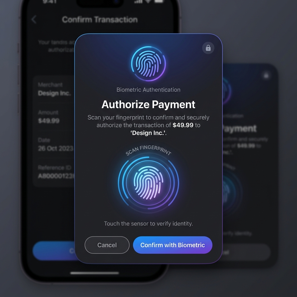
// Check biometric support availability
val status = isBiometricAvailable() // Returns BiometricStatus.AVAILABLE, NOT_AVAILABLE, NOT_ENROLLED, etc.

if (status == BiometricStatus.AVAILABLE) {
    // Trigger biometric authentication prompt
    val result = authenticateBiometric(
        title = "Verify Identity",
        subtitle = "Please scan your face or fingerprint to log in",
        negativeButtonText = "Cancel"
    )
    result.onSuccess { authenticated ->
        if (authenticated) {
            // User authenticated successfully
        } else {
            // User cancelled the prompt
        }
    }.onFailure { error ->
        // Handle authentication failure/error
    }
}
DateUtils
Extends KotlinX DateTime functionalities with localized parsing, formatting, and arithmetic helpers.
// Get current system LocalDateTime
val current = getCurrentDateTime()

// Calendar calculations
val days = daysInMonth(year = 2026, month = 6)
val daysAlt = myLocalDate.daysInMonth()

// Localized string formatting
val dateStr = myLocalDate.toLocalString(DateFormats.WWW_MMM_DD)
val timeStr = myLocalTime.toLocalString(showSeconds = true)

// Date arithmetic
val nextWeek = myLocalDateTime.plus(1, DateTimeUnit.WEEK)
val pastMonth = myLocalDateTime.minus(1, DateTimeUnit.MONTH)
ImageUtils
Provides platform-specific image processing operations for rotation, resizing, and base64 conversions.
// Resize images to a maximum dimension
val resizedBitmap = resizeImage(originalImageBitmap, maxSize = 800)
val resizedBytes = resizeImage(originalByteArray, maxSize = 800)

// Rotate images by a given angle
val rotatedBytes = rotateImage(originalByteArray, angle = 90)

// Conversions
val base64Str = myImageBitmap.toBase64()
val bitmapFromBytes = myByteArray.toImageBitmap()
val bytesFromBitmap = myImageBitmap.toByteArray()
FileUtils
Provides native file sharing mechanics.
// Trigger system share sheet with bytes payload
shareFile(fileBytes, fileName = "report.pdf")
NumberUtils
Converts numbers to currencies and handles mathematical angle conversions.
val currency = 1250.75.toCurrency() // Returns formatted local currency string (e.g. "$1,250.75")
val rads = 180.0.toRadians()
val degs = 3.14159.toDegrees()
StringUtils
Validates formatting structures.
val isGuid = "f81d4fae-7dec-11d0-a765-00a0c91e6bf6".isGuid()
val isNotGuid = "invalid-id".isNotGuid()
Visual Styling
Allows dynamic modification of System UI navigation and status bar elements directly from Compose.
@Composable
fun ScreenContent() {
    SetStatusBarColor(color = MaterialTheme.colorScheme.primary, darkIcons = false)
    SetNavigationBarColor(color = Color.Black, darkIcons = false)
}
General Utils
// String extensions
val isValid = "test@example.com".isEmail()
val isNotEmail = "invalid".isNotEmail()
val passwordValid = isValidPassword("StrongPass1!")

// Uuid extensions
val uuidEmpty = myUuid.isEmpty()
val uuidNotEmpty = myUuid.isNotEmpty()

// Base64
val base64 = myByteArray.toBase64()

// Browser
openUrl("https://www.google.com")
Serializers
KMPBase provides pre-configured Kotlinx Serialization serializers for core data structures (like Uuid and date types) to ensure correct conversion across platform layers.
InstantSerializerLocalDateSerializerLocalDateTimeSerializerLocalDateTimeTimestampSerializerLocalTimeSerializerUuidSerializer
@Serializable
data class UserSession(
    @Serializable(with = UuidSerializer::class)
    val id: Uuid,
    @Serializable(with = LocalDateTimeSerializer::class)
    val createdAt: LocalDateTime
)
Theme and Styling
The module exposes unified Material Design 3 theme configurations, custom shapes, and color palettes.
- AppTheme: Setup wrapping Composable that dynamically configures the color scheme based on user preference, system dark mode state, and Android 12+ dynamic color parameters.
- CustomShapes: Exposes extra shapes definitions like circular, rounded, or custom-cut borders for cards and pickers.
Requirements
- Android: Min SDK 24, Target SDK 37
- iOS: iOS 12.0+
- Kotlin: 2.4.0
- Compose Multiplatform: 1.11.1