KMPControls
KMPControls is a Kotlin Multiplatform library that provides advanced date and time picker components, along with other useful UI controls, offering a native look and feel across Android and iOS platforms.
Features
- Cross-platform Pickers: Fully functional Date, Time, and DateTime pickers.
- Dialogs: Customizable standalone Calendar and Clock dialogs.
- Additional Controls:
PasswordControl: Password input with visibility toggle.SearchControl: Search bar component.
- Material Design 3: Built using Jetpack Compose Material 3.
- Kotlin Multiplatform: Seamless support for Android and iOS.
Installation
Add the dependency to your project.
Using Version Catalog
If you are using a version catalog (e.g., libs.versions.toml), add the following:
[versions]
sweetmesoft = "2.0.1"

[libraries]
sweetmesoft-kmpcontrols = { module = "com.sweetmesoft.kmpcontrols:kmpcontrols", version.ref = "sweetmesoft" }
Build Gradle
In your build.gradle.kts (commonMain source set):
implementation(libs.sweetmesoft.kmpcontrols)
Android Initialization
For Android, you need to initialize the library in your MainActivity to support features like vibration feedback.
// In your Android MainActivity.kt
import com.sweetmesoft.kmpbase.BaseAndroid

class MainActivity : ComponentActivity() {
    override fun onCreate(savedInstanceState: Bundle?) {
        super.onCreate(savedInstanceState)

        // Initialize SweetMeSoft KMP Library
        BaseAndroid.initSweetMeSoft(this)

        setContent {
            // Your content
        }
    }
}
Permissions (Android)
For haptic feedback (vibration) in pickers, add the following permission to your AndroidManifest.xml:
<uses-permission android:name="android.permission.VIBRATE" />
Usage
DatePicker
A text field that opens a calendar dialog when clicked.
import com.sweetmesoft.kmpcontrols.pickers.DatePicker
import kotlinx.datetime.Clock
import kotlinx.datetime.TimeZone
import kotlinx.datetime.toLocalDateTime

// ... inside your Composable
var selectedDate by remember { mutableStateOf(Clock.System.now().toLocalDateTime(TimeZone.currentSystemDefault()).date) }

DatePicker(
    value = selectedDate,
    title = "Select Date",
    onSelectedDate = { date ->
        selectedDate = date
    }
)
TimePicker
A text field that opens a clock dialog when clicked.
import com.sweetmesoft.kmpcontrols.pickers.TimePicker

var selectedTime by remember { mutableStateOf(Clock.System.now().toLocalDateTime(TimeZone.currentSystemDefault()).time) }

TimePicker(
    value = selectedTime,
    title = "Select Time",
    onSelectedTime = { time ->
        selectedTime = time
    }
)
DateTimePicker
A text field that opens a calendar dialog followed by a clock dialog.
import com.sweetmesoft.kmpcontrols.pickers.DateTimePicker

var selectedDateTime by remember { mutableStateOf(Clock.System.now().toLocalDateTime(TimeZone.currentSystemDefault())) }

DateTimePicker(
    value = selectedDateTime,
    title = "Select Date & Time",
    onSelectedDateTime = { dateTime ->
        selectedDateTime = dateTime
    }
)
CalendarDialog
Use the calendar dialog directly.
import com.sweetmesoft.kmpcontrols.dialogs.CalendarDialog

CalendarDialog(
    isVisible = showCalendar,
    value = selectedDate,
    onDismiss = { showCalendar = false },
    onDateSelected = { date ->
        selectedDate = date
        showCalendar = false
    }
)
ClockDialog
Use the clock dialog directly.
import com.sweetmesoft.kmpcontrols.dialogs.ClockDialog

ClockDialog(
    isVisible = showClock,
    value = selectedTime,
    onDismiss = { showClock = false },
    onTimeSelected = { time ->
        selectedTime = time
        showClock = false
    }
)
PasswordControl
A password input field with a visibility toggle icon.
import com.sweetmesoft.kmpcontrols.controls.PasswordControl

var password by remember { mutableStateOf("") }

PasswordControl(
    value = password,
    label = "Password",
    onValueChange = { password = it }
)
SearchControl
A search bar component.
import com.sweetmesoft.kmpcontrols.controls.SearchControl

var query by remember { mutableStateOf("") }

SearchControl(
    value = query,
    placeholder = "Search...",
    onValueChange = { query = it },
    onSearch = {
        // Perform search
    }
)
ClickableOutlinedTextField
A text field wrapper that triggers a callback when clicked while preventing the soft keyboard from opening. Useful for date pickers, dropdowns, or selection prompts.
import com.sweetmesoft.kmpcontrols.controls.ClickableOutlinedTextField
import androidx.compose.ui.graphics.Color

ClickableOutlinedTextField(
    value = selectedOptionLabel,
    title = "Select Option",
    color = Color.Blue,
    onClick = {
        // Trigger dialog or sheet
    }
)
TermsAndConditions
Displays localized terms of service and privacy policy disclaimer text with embedded clickable links.
import com.sweetmesoft.kmpcontrols.controls.TermsAndConditions
import androidx.compose.ui.graphics.Color

TermsAndConditions(
    urlTerms = "https://example.com/terms",
    urlPrivacy = "https://example.com/privacy",
    color = Color.Blue // Highlight link color
)
DoublePicker
Input control for numeric double values.
import com.sweetmesoft.kmpcontrols.pickers.DoublePicker

var amountStr by remember { mutableStateOf("0.0") }

DoublePicker(
    title = "Amount",
    value = amountStr,
    onValueChange = { newValue ->
        amountStr = newValue
    }
)
AutoCompleteTextField
A text field component that displays a dropdown list of filtered suggestions as the user types.
import com.sweetmesoft.kmpcontrols.controls.AutoCompleteTextField
var query by remember { mutableStateOf("") }
val suggestions = listOf("Apple", "Banana", "Cherry")
AutoCompleteTextField(
value = query,
title = "Select Fruit",
suggestions = suggestions.filter { it.contains(query, ignoreCase = true) },
onValueChange = { query = it },
onSuggestionSelected = { selected ->
query = selected
true
}
)
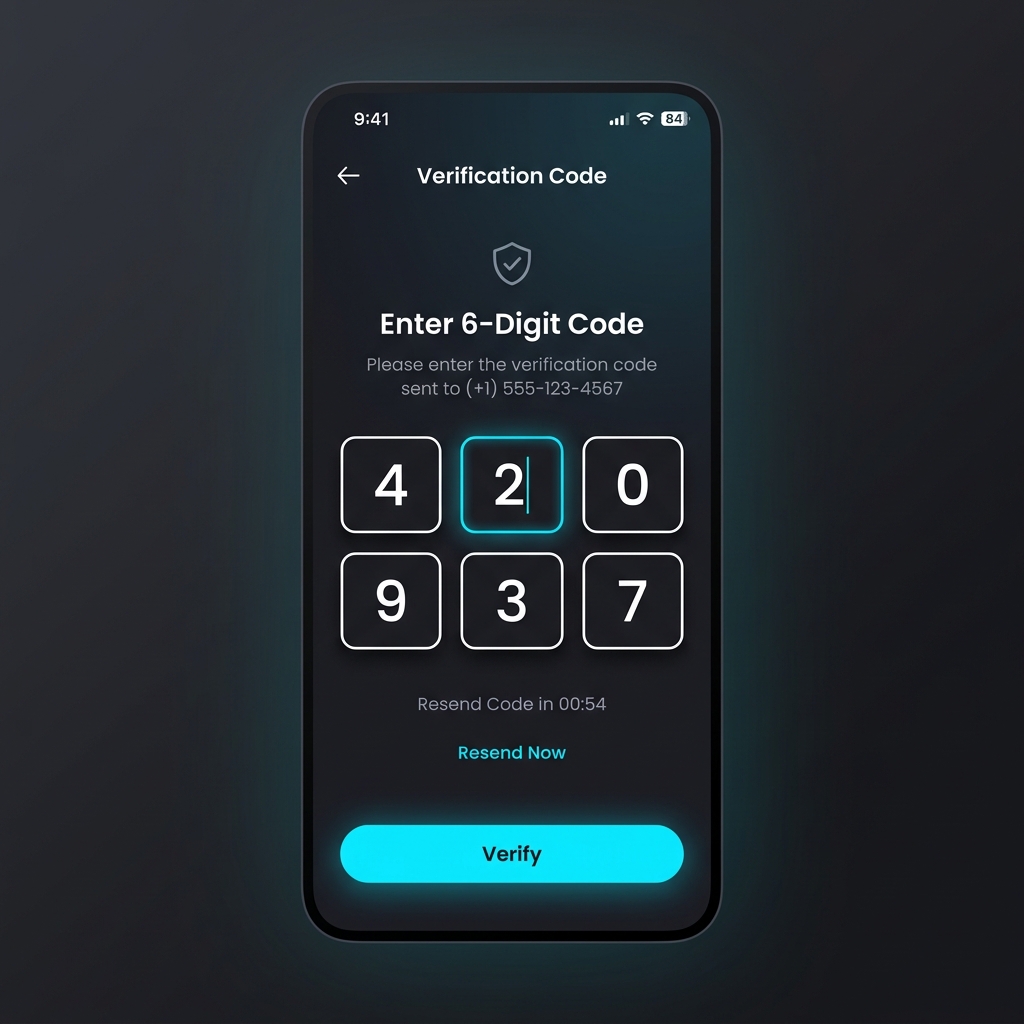
### OtpControl
A premium custom OTP / PIN text field control with parameterized length, numeric validation, and custom character masking.
```kotlin
import com.sweetmesoft.kmpcontrols.controls.OtpControl
var otpValue by remember { mutableStateOf("") }
OtpControl(
value = otpValue,
onValueChange = { otpValue = it },
length = 6,
isMasked = false, // Set to true to mask digits (like a PIN)
onComplete = { completedOtp ->
// Callback triggered when all digits are entered
}
)
API Reference
Pickers
DatePicker
value:LocalDate- The currently selected date.onSelectedDate:(LocalDate) -> Unit- Callback when a date is selected.title:String- Label for the text field.minDate,maxDate:LocalDate- Date range constraints.color:Color- Primary color for the picker.
TimePicker
value:LocalTime- The currently selected time.onSelectedTime:(LocalTime) -> Unit- Callback when a time is selected.title:String- Label for the text field.
DateTimePicker
value:LocalDateTime- The currently selected date and time.onSelectedDateTime:(LocalDateTime) -> Unit- Callback when date and time are selected.
DoublePicker
value:String- Current double input value.onValueChange:(String) -> Unit- Callback for text changes.title:String- Label for the input text field.enabled:Boolean- Controls the enabled state of the input.
Controls
AutoCompleteTextField
value:String- Current text value.onValueChange:(String) -> Unit- Callback when text changes.title:String- Label for the input text field.suggestions:List<String>- List of strings to display in the dropdown.onSuggestionSelected:(String) -> Boolean- Callback triggered when a suggestion is clicked.
PasswordControl
value:String- Current password text.onValueChange:(String) -> Unit- Callback for text changes.label:String- Label text.isError:Boolean- Whether to show error state.
OtpControl
value:String- Current OTP/PIN text.onValueChange:(String) -> Unit- Callback triggered when code changes.length:Int- Total number of digits/cells (default is 6).isMasked:Boolean- Mask characters as dots (default is false).isError:Boolean- Show error state (default is false).onComplete:((String) -> Unit)?- Callback triggered when code matches the target length (default is null).
SearchControl
value:String- Current search query.onValueChange:(String) -> Unit- Callback for text changes.onSearch:(String) -> Unit- Callback when search action is triggered (e.g., keyboard enter).
ClickableOutlinedTextField
value:String- Current text to display.title:String- Label for the text field.color:Color- Custom accent highlight color.enabled:Boolean- Interaction switch.onClick:() -> Unit- Click event handler.
TermsAndConditions
urlPrivacy:String- Target web address for privacy policy link.urlTerms:String- Target web address for terms and conditions link.color:Color- Highlight color for the link labels.
Requirements
- Android: Min SDK 24, Target SDK 37
- iOS: 12.0+
- Kotlin: 2.4.0
- Compose Multiplatform: 1.11.1
License
This project is licensed under the MIT License.